Numerals
Language:
ENG ELL EPO JBO TLH
LAT
Numerals |
||
|
|
||
|
Language:
ENG ELL EPO JBO TLH
LAT |
There was more than one Ancient Greek scheme for numeration; the main scheme used in inscriptions, the acrophonic, is the subject of a recent proposal to Unicode by the TLG. However, the system which prevailed in Greek until the introduction of Arabic numerals was the Milesian system, introduced to Athens along with the Ionic alphabet from the city of Miletus in Ionia. The Milesian numeric system has the same basis as the Hebrew: 9 letters are assigned to each of the units 1-9, 9 letters to the tens 10-90, and 9 letters to the hundreds 100-900.
In Hebrew this is sensible, what with its alphabet having 27 letters. In Greek, this was a problem, with the Phoenecian letters redundant to Greek phonology being dropped—even though Ionia was adding extra vowel letters and compound consonant letters. So to make the required 27 letters, Miletus needed to conscript three obsolete letters: digamma, koppa, and sampi.
The conscription worked so well, that these characters became commonplace as numerals, and unknown as letters. As a result, the numeric versions of the characters drifted away from their original natures—aided by the fact that the numerals got uncial and thence lowercase versions as they were incorporated into the mediaeval development of the Greek script, whereas the archaic letters remained frozen on stone, and forgotten by the scribes. The drift has been so complete, that the numerals can be regarded as distinct characters now from the original archaic letters. In fact, one of them has been regarded as distinct for centuries; Unicode has embraced the disunification of the second; and the only reason the third hasn't been disunified yet is that the archaic original is really, really obscure.
The domain of use of Greek numerals in Modern Greek is somewhat restricted compared to that of Roman numerals in the West. Their use for Anno Domini dates is confined to the church—which is ironic, considering that Byzantium used Anno Mundi dating instead. They are used to number volumes and prefatory page numbers (though with recent competition from post-asterisked Arabic numerals); chapters and books in the Bible; paragraphs in formal writing (as are Arabic numerals); secular and ecclesiastical rulers; and administrative divisions—soccer divisions, classes in school, electoral districts. To my knowledge, there is no Greek tradition of using them to number movie sequels.
U+03DB Greek Small Letter Stigma [ϛ]
In the Milesian scheme, the sixth letter of the alphabet, standing for 6, is the digamma—just as its Latin equivalent F is the sixth letter of the Latin alphabet. While digamma survived longer than other letters in the alphabet as used outside Attica, it did not survive into Attic and Koine, so that by the early first millenium AD, it was known only as a numeral.
As a numeral, digamma had its shape change as Greek
script turned to uncial and then lowercase; instead
of ϝ, the uncial version look more like ![]() . With its
status as a letter for /w/ forgotten, it was easy
to conflate the numeric sign with another, similar
sign:
. With its
status as a letter for /w/ forgotten, it was easy
to conflate the numeric sign with another, similar
sign: ![]() stigma, the ligature for sigma-tau. As a result,
the ligature and the numeral came to be considered
the same sign. Indeed, only classicists are aware
that digamma and stigma ever were the same sign—and
not all of them, either.
stigma, the ligature for sigma-tau. As a result,
the ligature and the numeral came to be considered
the same sign. Indeed, only classicists are aware
that digamma and stigma ever were the same sign—and
not all of them, either.
This has had several peculiar consequences for what stigma is displayed as. One will occasionally see it rendered with a final sigma, ς, since the two signs are so similar. This substitution is like the en-dash: when you're not aware of the subtle distinction, you don't notice the misuse, and once you are aware of it, the misuse is grating.
Another peculiar consequence is that the Number of the Beast, 666 (χξϛ in the Milesian scheme) is now "pronouncable", as kh.ks.st (instead of kh.ks.w). I trust that identification is not the reason why chemical manufacturers Hoechst merged themselves out of existence in 1999. (Their ads in Australia featuring kids trying to pronounce their name probably ruled them out for Armaggedon anyway.)
Surprisingly the final sigma is not abused all that much in Greece to stand in for stigma. Instead, the combination στ (or ΣΤ) is used—extrapolating from the not unreasonable premise that, if the sigma-tau ligature stands for 6, so does the expansion of the ligature. This expansion is unknown in Classics, and is confined to Greece; it does not appear to be particularly stigmatised (heh), and is widely used in administration. It is if anything more frequent now in Greece than stigma itself.
Incidentally, while the glyph for stigma is the glyph for the sigma-tau ligature, the ligature itself should not be represented in text by the stigma codepoint: the codepoints should be U+03C3 Greek Small Letter Sigma U+03C4 Greek Small Letter Tau. The reasons why should be fairly clear by now. The stigma ligature survived the rejection of ligatures in the 18th century, and was in common use in Greece in the early 19th century. It has no contemporary use, however.
The number 6 is much more frequent in use than 90 or 900, especially in the non-scholarly contexts where Greek numerals are used. (Cf. how frequent the Roman numeral VI is versus XC or CM—taking dates out of the equation.) So the absence of stigma from typewriters and 8-bit Greek fonts was felt more acutely for the stigma than the koppa or sampi—which explains why the expansion into στ has prospered so in Greece.
In contrast to koppa, there is no significant tradition of digamma being used as a numeral in editions of classical texts, even though the Ancients clearly used digamma rather than stigma as their numeral. In the TLG corpus, where Ancient mathematicians and astronomers are well represented, digamma comes up only in descriptions of geometric lines—where the constituent letters have always had their alphabetic rather than numeric values. In the following text by Ptolemy, in fact, the editor distinguishes between geometric (here, actually, musical) digamma and numeric stigma:
εἰλήφθω δὴ τῷ Β ἰσότονος ὁ Η καὶ πεποιήσθω ἀπ’ αὐτοῦ ἐπὶ τὸ ὀξύτερον τετράχορδον ὅμοιον τῷ ΑΒΓΔ τὸ ΕϜΖΗ. εὑρεθήσεται τοίνυν ὁ Α τοῦ Ϝ ὀξύτερος —ἰσότονοι δὲ οἱ ΒΗ — μείζων ἐστὶν ἄρα καὶ ὁ τῶν ΑΒ λόγος τοῦ τῶν ϜΗ, ἀλλ’ ὁ τῶν ϜΗ ὁ αὐτὸς ὑπόκειται τῷ τῶν ΒΔ. μείζων ἐστὶν ἄρα καὶ ὁ τῶν ΑΒ λόγος τοῦ τῶν ΒΔ. ὁ μὲν τῶν ΑΒ ἄρα ἔσται ἐπὶ ϛʹ, ὁ δὲ τῶν ΒΔ ἐπὶ ζ ʹ. (Ptolemy, Harmonica 2.1)
Let the note H be taken to be in unison with B, and from there let the higher four-note scale EFGH be taken, similar to ABCD. Now, A will turn out to be higher than F—since B and H are in unison; so the ratio of A to B will also be greater than that of F to H; but that same ratio of F to H will be less than that of B to D. Therefore the ratio of A to B will also be greater than that of B to D. And the ratio of A to B shall be 1:6, while that of B to D shall be 1:7.
There are only two exceptions in the corpus, where digamma is used in chapter headings: works by the 5th century AD theologians Palladius (P.R. Coleman-Norton, Palladii dialogus de vita S. Joanni Chrysostomi. Cambridge: Cambridge University Press, 1928), and Theodoret (J.-N. Guinot, Théodoret de Cyr. Commentaire sur Isaïe, vols. 1-3 [Sources chrétiennes 276, 295, 315. Paris: Cerf, 1:1980; 2:1982; 3:1984]):
<ΚΕΦΑΛΑΙΟΝ ΙϜ ʹ>
{Ο ΔΙΑΚ. } Σύγγνωθί μοι, πάτερ, ὑπερβαίνει μέθην καὶ μανίαν καὶ παίγνιον τὰ τοιαῦτα. οἱ μὲν γὰρ μαινόμενοι καὶ μέθυσοι καὶ οἱ παῖδες, οἱ μὲν μετὰ τὴν νῆψιν, οἱ δὲ μετὰ τὴν πέψιν, οἱ δ’ ἄλλοι μετὰ τὴν ἔννομον ἡλικίαν ἀρνοῦνται, ἐπαισχυνόμενοι τοῖς αἰσχρῶς ἢ ἀτάκτως γεγενημένοις ἢ λελεγμένοις (Palladius, Dialogus de vita Joannis Chrysostomi, p. 93)
[Chapter XVI]
(DEACON:) Forgive me, father, but these things are worse than drunkenness, wrath or childishness. For the enraged, drunkards and children, after attaining sobriety, digestion, or adulthood, reject in shame what they have done or said disgracefully or disorderly.
This use of digamma may reflect the source manuscript—though I doubt the scribes were differentiating digamma from stigma by the time Palladius was copied; and unlike Theodoret, the Palladius has the chapter headings in angle brackets, implying that they are interpolated by the editor. Since editors of classical texts routinely use stigma, it is fair to conclude that the numeric use of digamma is an affectation of the part of these two editors.
U+03DF Greek Small Letter Koppa [ϟ]
The obsolete letter koppa was placed between pi (80)
and rho (100)—just as Q in the Latin alphabet lies
between P and R. Like digamma, the numeric version
of koppa underwent significant
change
in
uncial and
lowercase
Greek,
taking it far away from the archaic letter ϙ. Michael
Everson, in his December 1998 proposal for the disunification
of archaic and numeric koppa, sketches part of this
development ("The Missing Link"). The transition
was from the archaic Q-form koppa, via the uncial
forms ![]() (what Everson terms "missing-link koppa", and represented
in Unicode by U+10341 Gothic Letter
Ninety: 𐍁), to the modern Z-form numeral,
(what Everson terms "missing-link koppa", and represented
in Unicode by U+10341 Gothic Letter
Ninety: 𐍁), to the modern Z-form numeral, ![]() .
.
There has been much more confusion about the form of koppa than for stigma, this time in the Classics domain. While Modern Greece uses the Z-form character to the exclusion of any other form, Classical editors frequently use the uncial form—particularly the "backwards question mark", which has the regrettable property of being identical to some uncial stigmas, and uncomfortably close to all other stigmas. The editor of Dioscorides Pedanius (i AD: M. Wellmann, Pedanii Dioscuridis Anazarbei de materia medica libri quinque, 3 vols. Berlin: Weidmann, 1:1907; 2:1906; 3:1914), was particularly taken with this glyph—which, given that Dioscorides was a medical author full of prescriptions with numbers in them, made data entry of the text for the TLG quite hairy.
The rare but entertaining kludge of using an upside-down 5 as a koppa also alludes to the uncial form.
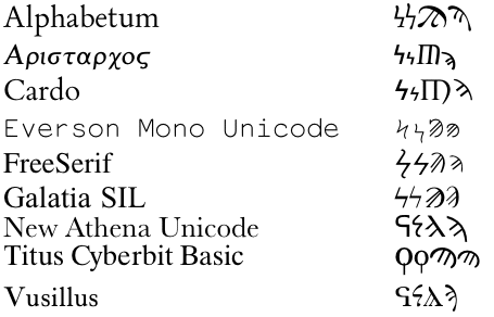
Classical editors also tend to use the Q-form koppa as a numeral; Everson's illustration is from Smyth's grammar itself. So there is a three-way split in usage of numerical koppa: Classicists use Q, and more rarely the uncial, while Modern Greeks use Z exclusively. This diversity is also reflected in the available Unicode fonts—with the added complication that some fonts predate the addition of lowercase numerals, or archaic koppa, to the Unicode standard:
| Font | Archaic Koppa | Numeric Koppa | Small Numeric Koppa |
|---|---|---|---|
| Alphabetum Unicode | Q |
Z |
Z |
| Aristarcoj | Q |
Z |
Z |
| Cardo | Q |
Z |
Z |
| Everson Mono Unicode | Q |
Z |
Z |
| TITUS Cyberbit Basic | Q
|
Z
|
Z
|
| FreeSerif | — |
Z |
Z |
| Galatia SIL | — |
Z |
Z |
| Lucida Sans Unicode | — |
Z |
— |
| New Athena Unicode | Q |
Uncial |
Uncial/Z |
| Vusillus | Q |
Uncial |
Uncial/Z |
| Vusillus Old Face | — |
Q |
Q |
| Aisa Unicode | — |
Q |
Uncial |
| Arial Unicode MS | — |
Q |
— |
| Palatino Linotype | —
|
Uncial
|
—
|
| Galilee Unicode Gk | Q |
— |
— |
The disunification of archaic and numeric koppa therefore is a Modern Greek rather than a Classicist's idea; but for Modern Greeks it makes sense. Without a rather more thorough-going classical education than one can expect from the Greek secondary education system, Modern Greeks simply do not recognise ϙ at all, let alone as a glyph variant of ϟ. And it is possible (though more difficult than for stigma) to devise a case where the two would need to be differentiated in print: a Modern Greek epigraphy manual, using Milesian numerals for the pagination of its preface or for the numbering of the inscriptions it includes, would use the Q in the inscriptions itself, and the Z in any numbering.
If Western Classicists want to use the Q-form koppa in both contexts, then of course nothing prevents them from doing so with the Archaic Koppa codepoint. This means that you are foregoing the semantic distinction between numerical Z (or uncial) and inscriptional Q that the Modern Greek system allows you; but allowing both koppas to match a search for the numeral 90 is not a massive sacrifice to make.
U+03E1 Greek Small Letter Sampi [ϡ]
The letter conscripted for 900 is of strange pedigree; it may be an uncial version of San, as Thompson (1912:91) suggests, but it seems likelier to be a continuation of a character invented in Ionia (where Miletus was—though Miletus itself did not use it to our knowledge) (Jeffery 1990:39, who lists the cities of Ephesus, Erythrae, Teos, Halicarnassus, Cyzicus, Pontic Mesambria, Chalcedon, Samos, Massalia -- with rare usage also in Attica). The place of san in the alphabet was between pi and koppa, so it would make no sense for a survival of san to be tacked on at the end of the alphabet, after omega (itself an Ionian invention). Jeffery (1990:327) believes the san had dropped out in Ionia before the numeric system was invented, while the local invention of sampi had been slotted in at the very end of the alphabet. It is typical in alphabets for novel inventions to trail at the end of the alphabet: the letters after tau are all Greek innovations (upsilon being a bifurcation of wāw from digamma), and the same holds for the Latin reimportations from Greek of Y, Z, and the Cyrillic letters after ha.
The identification of the Ionic letter with the numeral is conjectural, and Jeffery herself titles the letter "sampi" in scare-quotes, because she does not believe that was the original name of the letter. While traditionally sampi is deemed to represent a combination of san and pi, pi makes no sense for the ancient letter (which corresponded to /ss/ and /ks/ in inscriptional use), and Jeffery thinks the late name was simply the descriptive [ὡ]σὰν πῖ: "like a pi". Before the Ionic letter was identified with the numeral, it was termed disigma, on account of its usual phonetic value. (See the discussion at www.parthia.com for more information on the history of sampi.)
If the Ionian letter is indeed the same as numeric
sampi, its development has been as convoluted as
that of koppa. The short-lived Ionic letter (550-450
BC) had the form ![]() —which was indeed "like a pi". As an uncial, it shifted
to
—which was indeed "like a pi". As an uncial, it shifted
to ![]() —as preserved in Unicode in U+1034A
Gothic Letter Nine
Hundred: 𐍊. The modern form comes from mediaeval scribal practice.
(A case may be made for disunifying
archaic from numeric
sampi,
and I
discuss
this elsewhere.)
—as preserved in Unicode in U+1034A
Gothic Letter Nine
Hundred: 𐍊. The modern form comes from mediaeval scribal practice.
(A case may be made for disunifying
archaic from numeric
sampi,
and I
discuss
this elsewhere.)
The numeral is rare, but I am unaware of any
real variation in its usage: all Unicode fonts I
know how have the curved-back version, with different
degrees of concavity (see chart). SIL Galatia Extras includes a lambda-like variant, ![]() .
.
While sampi is almost always numeric, it was very rarely used as a "spare letter" in geometry as well. Hero of Alexandria used it in his complicated manual (complete with diagrams) on how to make a catapult:
Οὕτως δὲ συντεθέντων τῶν ἡμιτονίων καὶ τῶν ἀγκώνων εἰς τὸ ἐκτὸς ἀναπεπτωκότων, τοῦ μὲν ἐν τῷ ΑΒΓΔ ἐπὶ τὰ πρὸς τὸ Υ ὥσπερ τοῦ Ϝϡ, τοῦ δὲ ἐν τῷ ΕΖΗΘ ἐπὶ τὰ πρὸς τὸ Φ ὥσπερ τοῦ Χϙ, δεῖ δὴ τὴν τοξῖτιν νευρὰν κατάγειν, ὡς εἴρηται, καὶ ἐπιθέντα τὸ βέλος ἀποσχάζειν. (Hero, Belopoeica 23)
With the half-skeins put together and the torsion engine recoiling outwards, and ABCD folded onto V just like FÞ, while EGHI is folded onto W just like XR, the bowstring must be wound up, so to speak, and the arrow placed on it and shot off.
Hero uses all three obsolete Milesian letters for his "attach slot A to tab B" exposition—digamma (not yet stigma), sampi, and koppa (not yet numeric). I have allowed myself the luxury of using thorn as the 27th Roman letter.
Incidentally, the Coptic numeric system follows Greek;
for 6, 90, and 900, it uses U+2C8B Coptic Small Letter
Sou, ⲋ (like stigma, a numeral only), U+03E5 Coptic Small
Letter Fei, ϥ, and U+2CC1 Coptic Small Letter Sampi, ⳁ.
U+03DA Greek Letter Stigma [Ϛ]; U+03DE Greek Letter Koppa [Ϟ]; U+03E0 Greek Letter Sampi [Ϡ]
As with Roman numerals, different contexts tend to encourage different casing of numerals in Modern Greek practice. Lowercase is used for scholarly contexts—dates, page numbers, paragraphs; concomitant with that, lowercase is used exclusively in Classical texts (and presumably reflects mediaeval scribal practice). Numbers associated with titles tend to be uppercase: volumes, administrative divisions, numbers of kings and patriarchs, chapters of the Bible.
Part of Michael Everson's proposal for additional Greek characters (May 1998) was to introduce small letter versions of stigma, digamma, koppa, and sampi; these were found in earlier character sets, but had been excluded from Unicode on ELOT advice. Everson's proposal succeeded, and Unicode gained lowercase versions of the characters alongside the original characters, which were deemed to be capital.
Now, even if this wasn't a good idea, Unicode stability means it is too late to do anything about it. However, Everson's argument misses some subtleties.
For archaic letters, the case for an uppercase/lowercase is clear: the letters are fully alphabetic, and are subject to titlecase capitalisation as initials of either proper names or the beginnings of sentences. This is the case Everson makes for digamma, and it also applies to archaic Koppa. ELOT's objection that casing the digamma and the koppa is anachronistic, since the stones knew no case, is disingenuous—the point of Unicode is to encode editions, not stones, and the editors do make casing distinctions.
The argument Everson raises of cased stigma as a ligature is spurious, though, since Unicode has no business encoding ligatures as codepoints. (Since the proposal also included the omicron-upsilon and kai ligatures, it's fair to say Everson did not agree with that principle at that point.) Any casing of the stigma glyph is underlyingly represented by the case of the sigma codepoint.
The problem with numerals, though, is that the unmarked form of the numeric symbols, particularly in scholarship, is lowercase, not uppercase. So it was not the introduction of lowercase numerals that Everson needed to argue for, but uppercase. Making the backwards compatible numerals capital and the new symbols lowercase has had the unpleasant consequence that the "correct" numeric glyphs are less widely available than the "incorrect" ones.
The affected fonts are: Aisa Unicode, Arial Unicode MS, Lucida Sans Unicode, Palatino Linotype. Of course, Unicode is meant to bow to no existing font, but the absence of lowercase numerals in two of the default Microsoft fonts with polytonic Greek (Palatino and Arial) and the absence of all numerals in the third (Tahoma) is an inconvenience if you're trying to provide Greek text to as wide an audience as possible.
And while any visit to a Greek primary school will convince you of the need for a capital stigma (if for no other reason, to block out the horror of ΣΤ! instead of Ϛʹ), the case for a capital numeric koppa or sampi is not as obvious. This becomes particularly apparent with the variation between font designers as to how to render these capitals.
The problem with sampi and koppa is that they are rarely used in those contexts where Modern Greek would encourage capitals, so there is little guidance as to what they should look like. The alarm bells should be going off if, in his quite professional discourse on the characters, a professional typographer like Yannis Haralambous needs to refer to a history of mathematics (Boyer, C.B. 1968. A History of Mathematics. New York: Wiley) to get glyphs for capital archaic koppa and sampi, and admits that there is no standard capital form for numeric koppa.
On Boyer's archaic koppa capital, see archaic koppa. Boyer's sampi is the lambda-like glyph used by Vusillus.
Though Unicode is intended to provide a standard for existing typographic practice, and not to innovate new practice into being, this is what seems to have happened with capital koppa and sampi. The catch is that the innovations have been done by classics-oriented font designers, whereas the actual demand for capital numerals, if any, comes from Greece. But since use of the capital numerals is marginal, the Unicode glyphs are likely to end up setting the norms anyway.
Haralambous' curly koppa takes a little getting used to if you're familiar with the normal, plain Z-form koppa. (And typographically the Z-form koppa is traditionally very plain, which explains why, in the serifed/tapered fonts Aristarcoj, Cardo, Free Serif and Galatia SIL, koppa looks like a refugee from Helvetica—or from a Heavy Metal concert.) It is true, though, that the traditional plain koppa is not harmonious in a serifed font, and while Haralambous has expressed dissatisfaction with his koppas, the curly koppa fits into a serifed font quite well. (The Alphabetum hybrid form is particularly pleasant.) And though the curly koppa is a slight deviation from tradition, the koppa is still recognisable as such.
The capital sampi is still in flux, and has involved much greater deviation from the traditional, lowercase form. (I presume this variation is founded in earlier typography, but I don't currently have access to references on it.) Curiously, no font seems to have adapted the Unicode reference glyph, where the left leg of the sampi is straight and thin, and the right thick and bent. This glyph originates in Everson's additional character proposal, where he uses the same form for both upper and lower case: it is a glyph variant of sampi in general. This means that the distinction the code charts make between an uppercase sampi with different legs, and a lowercase sampi with parallel legs, is spurious—and font designers have not gone along with it. My own preference is for the capital glyph to be recognisably the same as the lowercase, but to have its capital status subtly marked typographically. Again, I think the nicest solution is Alphabetum's. Palatino Linotype's glyph also makes a fine swash capital—and a good link between the traditional form and the Cardo/Aristarcoj M-like sampi; it would be better still if Palatino actually had a lowercase sampi to contrast it with.
U+0374 Greek Numeral Sign [ʹ]
If you're using letters of the alphabet as numerals, you want to have some device for differentiating numbers from words. The main such device in antiquity and the middle ages was the overbar, which was also used to cite words. A prime or double prime, on the other hand, was used to indicate reciprocal fractions. The following passage from the Almagest shows the system in full flower:
ιαʹ. ἑνδέκατός ἐστι παράλληλος, καθ’ ὃν ἂν γένοιτο ἡ μεγίστη ἡμέρα ὡρῶν ἰσημερινῶν ιδ∠ʹ. ἀπέχει δ’ οὗτος τοῦ ἰσημερινοῦ μοίρας λϛ καὶ γράφεται διὰ ῾Ρόδου. καί ἐστιν ἐνταῦθα, οἵων ὁ γνώμων ξ, τοιούτων ἡ μὲν θερινὴ σκιὰ ιβ∠ʹγʹιβʹ, ἡ δὲ ἰσημερινὴ μγ∠ʹγʹ, ἡ δὲ χειμερινὴ ργ γʹ. (Ptolemy, Synaxis mathematica 1,1 p. 109)
11. The eleventh parallel is where the maximum day is 14 1/2 standard hours long. It is 36 degrees from the equator, and passes through Rhodes. And where the index of the sundial is 60, the summer shadow is 12 1/2 + 1/3 + 1/12° [12 11/12], and the equinoctal shadow is 32 1/2 + 1/3° [32 5/6], while the winter shadow is 103 1/3°.
In one of those twists that makes a Unicode guy's life interesting, the prime is now used in Greek to indicate that the string is a number, not a fraction. In fact, even the editor of the Almagest has snuck this past: the initial paragraph number has a prime, not an overbar.
As you will be relieved to know, if the text uses single prime for numbers, it uses double prime for fractions. Here's what another editor did with another text by Ptolemy:
καὶ πάλιν τὸ μὲν εἰς Ταίναρον τῆς Λακωνικῆς ἀπὸ Παχύνου μοιρῶν ιʹ, τὸ δ’ ἐντεῦθεν εἰς Ῥόδον ηʹδʹʹ, τὸ δ’ ἀπὸ Ῥόδου πρὸς τὴν Ἰσσὸν ιαʹδʹʹ, τὸ δ’ εἰς Εὐφράτην ἀπὸ τῆς Ἰσσοῦ δύο ἡμίσους (Ptolemy, Geographia 1.12.10)
And then from Pachynum [Passaro, Sicily] to Taenarum in Laconia is a distance of 10 degrees, and from there to Rhodes 8 1/4, and from Rhodes to Issus 11 1/4, and from Issus to the Euphrates two and a half.
At this point, one might wonder whether the keraia ("horn", the Greek name for this sign) does anything that U+02B9 Modifier Letter Prime doesn't do already. The answer is no, and U+0374 canonically decomposes to U+02B9 accordingly.
Since primes are not readily available on typewriters and computers in Greece, the exclamation point is seen instead of keraia, both handwritten and printed, very frequently; like στ for stigma, it's a kludge so frequent that it no longer surprises the eye. It's a pleasant surprise to note that it doesn't seem to be that frequent online; keraia was absent from the monotonic ELOT standard, Latin-7, so Unicode activism in including it so prominently may have saved it for posterity. (Which is more than can be said for the kai ligature.)
U+0375 Greek Lower Numeral Sign [͵]
The Milesian system only deals with numbers up to 999. Various tricks were eployed to get beyond that; for example, a diaeresis over a letter (or other combinations of dots: Thompson 1912:91) multiplied it by 10,000 (a myriad); so β̈ = 20,000. Or the number of myriads could be written on top of a Μ (for myriad); so Μβ (with the beta on top of the mu) was also 20,000. (If you needed something much bigger, you could stack a mu on top of a mu, which gave you 108, triple stacked mu, which gave you 1012, and so on.)
These techniques are unknown in Modern Greek usage. The only artifice which has survived—and that pretty much only because it is used in dates—is to use the left keraia in front of a Milesian number for thousands rather than units. So if βʹ is 2, ͵β is 2000, and ͵ββʹ is 2002.
Coptic uses a single overbar instead of the keraia, and a double overbar instead of the left keraia; so 1971 in Greek is ͵αϡοαʹ, and in Coptic ⲁ̿ⳁ̅ⲟ̅ⲁ̅.
Nick
Nicholas, opoudjis [AT] optusnet . com . auCreated: 2003-08-31; Last revision: 2005-04-09 URL: http://www.opoudjis.net/unicode/numerals.html
|